This story
starts a few years back at a women’s conference out on the coast. I had been
looking over the contents of the book table when I saw a book called Soul Custody by Stephen W. Smith. The
title intrigued me but when I picked it up, I had a hard time putting the book
down. The book itself was great and I later bought it, but it was the feel of
the cover that enthralled me. It was soft and velvety, a pleasure to just hold.
Someday, I wanted a book of mine to feel like that.
Unfortunately,
the next book I was publishing was the last of a trilogy and I needed to stay
with the mold I’d already created with the first two: 6x9, glossy covers,
illustrations, running headers, and white pages. But this book stands on its own. This book is complete in and of
itself. I can throw everything out the window and recreate a whole new look.
 To do this, I
wanted to talk to the printer in person. I wanted to look at examples of
previous books printed, to see for myself what they meant by “matte” covers. So this last weekend on my drive up to
celebrate Christmas early with my family, I stopped by my favorite print shop,
Gorham Printing, in Centralia,
Washington. As I’ve already
shared, we have a great working relationship and I trust their quality. I really
wanted to use them for this next book if possible.
To do this, I
wanted to talk to the printer in person. I wanted to look at examples of
previous books printed, to see for myself what they meant by “matte” covers. So this last weekend on my drive up to
celebrate Christmas early with my family, I stopped by my favorite print shop,
Gorham Printing, in Centralia,
Washington. As I’ve already
shared, we have a great working relationship and I trust their quality. I really
wanted to use them for this next book if possible.
Explaining to
the staff what I wanted, I was shown some matte cover books they’ve recently
printed. It was exactly what I had been hoping for. That soft, velvety feel,
the kind of cover you want to keep running your hand across, that’s what I
wanted for my book. Writing about love, I wanted the physical book itself to be
as warm as the people who inspired me to write it. I couldn’t have been
happier.
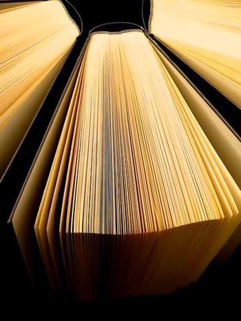
I also took a
look at books on their shelves printed with cream colored paper. This is a
decision I have been wrestling with: white or cream paper? I loved the idea of
the warmth of cream and that it was different and would match the softer feel
of the cover, but it could prove difficult for drawings. Looking at their
books, though, cream is going to win the day. If I stick to pencil
illustrations, I think it will look lovely. I want this book to be my best work
yet, both in aesthetics and in the writing. Cream paper is what I’ve envisioned
for so long, it just belongs to the
book now.
I hadn’t yet
decided on the size of the book. When I was putting the poems into their rough
order, I noted many of them were shorter than I’ve usually written in the past
and that means I won’t need as much physical space. I joked to my friend that I
must be a better writer if I can write less. Making the book a 5 ½ by 8 ½ would
also have the added benefit of being a bit cheaper than a 6 by 9, thus offsetting
the cost of the more expensive paper.
This time there
will be no running headers, just a page number centered on the bottom of the
page with a simple swirl or some such symbol above. As I wrote in my last post,
the poems will also stand on their own – no drawings on the same page, just at
the start of the sections. Less is more is my new mantra.
The staff at
Gorham sent me home with a printed matte cover from one of their current
projects. I keep running my fingers across its surface as I imagine what it
will be like to pick up my own book with such a cover for the very first time.
I’m loving being able to match the physical printing choices to what the book
is about. I also find it deeply inspiring as I continue writing, editing, and
putting the poems in order. It’s a book I
can now see in my mind as well as in my heart.
Labels: Publishing, Publishing a Book Series, Spirit Water Publications, Writing
 To do this, I
wanted to talk to the printer in person. I wanted to look at examples of
previous books printed, to see for myself what they meant by “matte” covers. So this last weekend on my drive up to
celebrate Christmas early with my family, I stopped by my favorite print shop,
Gorham Printing, in
To do this, I
wanted to talk to the printer in person. I wanted to look at examples of
previous books printed, to see for myself what they meant by “matte” covers. So this last weekend on my drive up to
celebrate Christmas early with my family, I stopped by my favorite print shop,
Gorham Printing, in